Protect
This dashboard provides insights into the effectiveness of your policy configurations and identifies overexposed data that may be at risk.
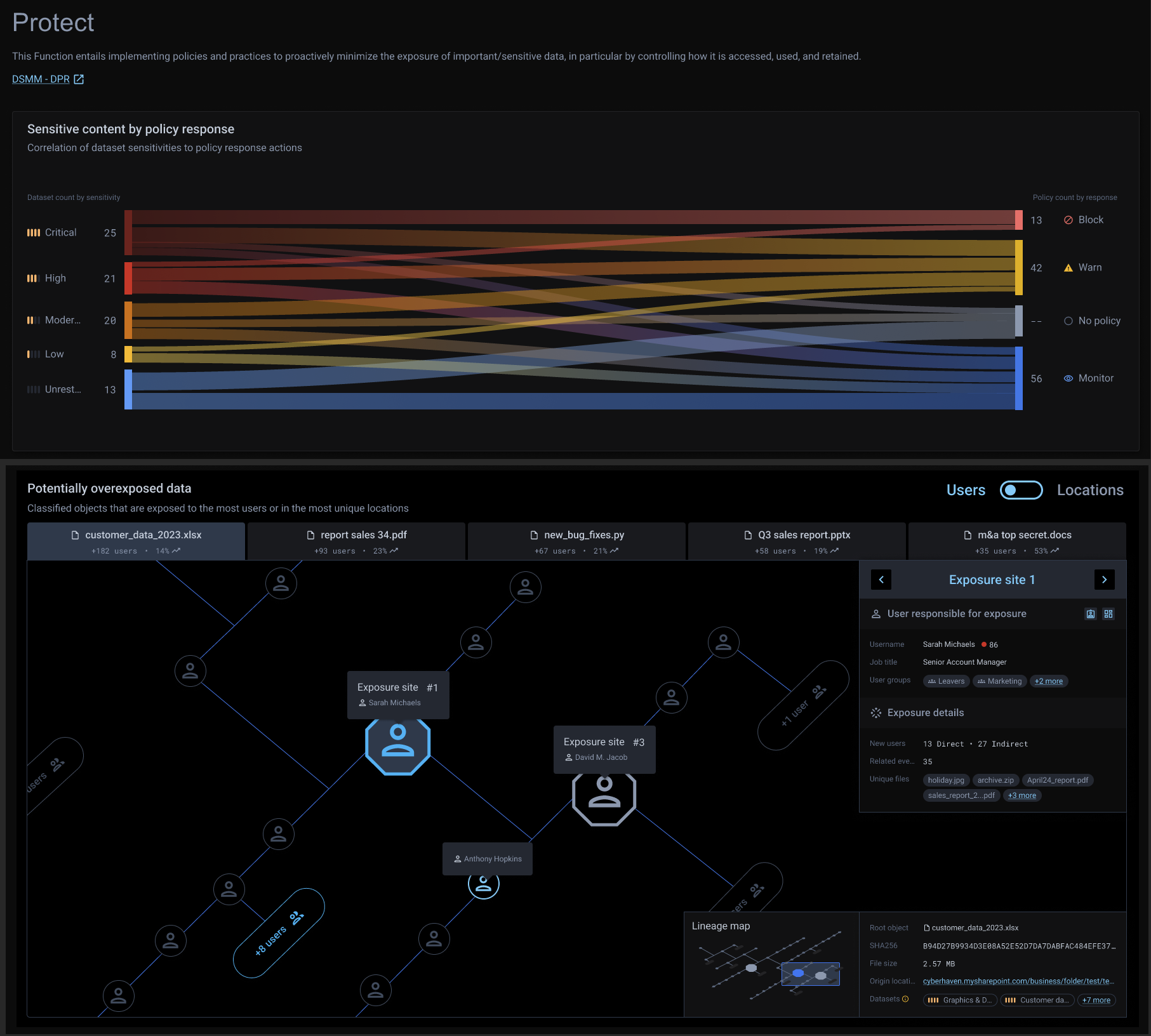
Sensitive content by policy response
This panel features a Sankey diagram correlating datasets with policy responses, illustrating the volume of datasets in each sensitivity category and their corresponding policy actions. It helps you assess your policy configurations, ensuring that classified data is included in a policy and that datasets labeled as “Critical” or “High” sensitivity have appropriate or associated policy responses.
You can hover over each flow in the diagram to view detailed information or click on a flow to navigate to the Risks Overview page, where you can access datasets and policy details.
Potentially overexposed data
This panel displays a lineage map of the top five overexposed files or data at risk. The map organizes the data based on either the users associated with the exposure events or the locations where the data was observed. Hexagonal bubbles in the map represent the users responsible for overexposing the data or the locations where the overexposure occurred.
The lineage map provides a chronological view, read from top left to bottom right, showing the progression of events that contribute to increased data exposure.
This panel helps you understand the sequence and relationships between events leading to overexposed data. It highlights the objects (users or locations) that contributed to significant increases in data exposure.
You can:
- Use the toggle button to switch the view between Users and Locations.
- Click and drag on the map to explore additional sections of the lineage.
- Hover over any node to view detailed information, or click on an object to navigate to the Events tab in the Risks Overview page for more context and details about that object.